There are five ways to isolate your subjects, by:
- Light
- Depth of Field
- Colour
- Texture
- Motion
You can combine all to increase visual impact. Subject isolation is important because it helps to direct your viewer's eyes to the portions of the frame to which you want them to pay attention. The better isolated your subject is, the stronger your composition becomes, and the less distracting any other potential unintended (or uncontrollable) elements in the frame are. Paying attention to subject isolation also makes you pay attention to the subject itself in the first place. You must know the subject of your photograph is, if not then you should really question why you are taking the shot in the first place.
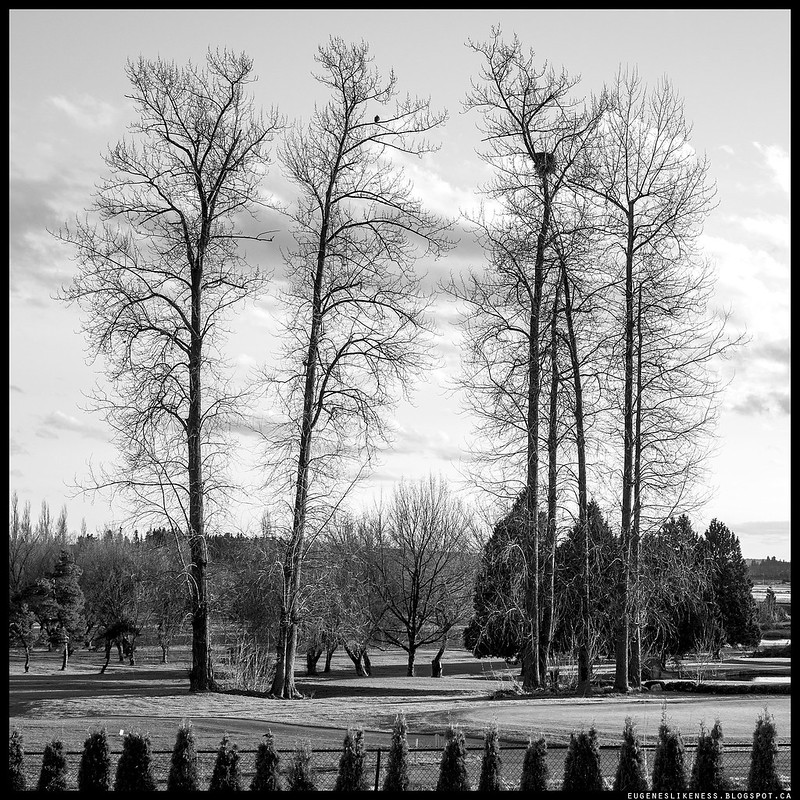
The photo above is one of my submissions. I had to submit 5 photos for this assignment; 3 of them were good, 1 failed and 1 was so so. The other 2 that passed can be seen below with Ming's comments but before that let's see what Ming has to say about the above photo.
"This is a really, really good image - beautiful side lighting defines the shape of the branches and gives things a wonderfully 3D effect. They're obviously isolated against the sky, but the sky itself isn't boring and plain - there's subtle texture in the background that's balanced left to right. The overall impression this image leaves is one of structure and balance, but not boring symmetry. There's also a healthy and even amount of space around all sides of the main subject, with no edge intrusions. The trees in the foreground are regular and not too prominent, but dark enough to form a good 'heavy' visual base. Subject isolation by light, texture, and tone - trees rarely move - so well done."
Here are the other 2:
Here are the other 2:

The doll is obviously a product or macro shot. I thought of including macro images for this assignment because with macros you would really have to separate your subject or isolate it or else it's no good. Ming said it's a bit of a cop out for this assignment but you know what, I'm glad I did because I learned another thing and it's a great tip. When producing macro images specially in a studio where you can control your environment, it is very common to use a solid and uniform background. This is because it makes your subject standout, there are less bg distractions and it's easy to isolate by colour. The challenge is when your out in an uncontrolled environment, how do you find a background that is uniformed to put your subject against.
Ok, so here is Ming's commentary about the doll: "Once again, nice light. The 3D shape of the doll is captured well; compositionally and balance-wise, it's difficult to go wrong with a central composition that has even space around the sides; but at the same time, it's not really exciting. This kind of light and placement makes for a good straight product shot except the whole product generally has to be in focus. Not really possible to have any background distractions, is it? ;) Isolation by light, texture, tone, DOF and colour - it's not the DOF bit that makes life easy, it's the uniform background. Find this when the shot isn't entirely in your control is the challenge."
Ok, so here is Ming's commentary about the doll: "Once again, nice light. The 3D shape of the doll is captured well; compositionally and balance-wise, it's difficult to go wrong with a central composition that has even space around the sides; but at the same time, it's not really exciting. This kind of light and placement makes for a good straight product shot except the whole product generally has to be in focus. Not really possible to have any background distractions, is it? ;) Isolation by light, texture, tone, DOF and colour - it's not the DOF bit that makes life easy, it's the uniform background. Find this when the shot isn't entirely in your control is the challenge."
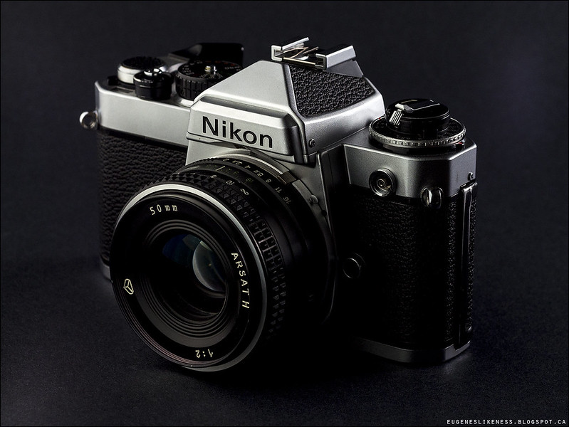
My old and beaten Nikon FE. It needs recalibration so for now it's a paper weight and a model :). Here are Ming's comments: "Interesting lens - something Russian? Nice light setup here; the rear kicker helps to define the shape of the back of the camera, and makes your dials look round. I would have moved the light on the left a bit further forwards to get a bit more catch light off the front and the lens, but that's a relatively minor thing. Balance of this one isn't quite as good as the doll because your subject is slightly differently shaped to the frame - note empty space at left and right - the question here becomes what to do with the empty space; I generally think it should be left in front of the subject as though it's facing something in anticipation." (And yes, the lens is Russian.)
The 4th image was not quite good as the main subject was slightly overexposed and the composition was a bit off, although the photo was visually rich in texture. And the 5th one failed because the background was very busy and was similar in texture with my subject so it served as visual camouflage. So there goes assignment 4, it's done. My next assignment is about Color or BW.
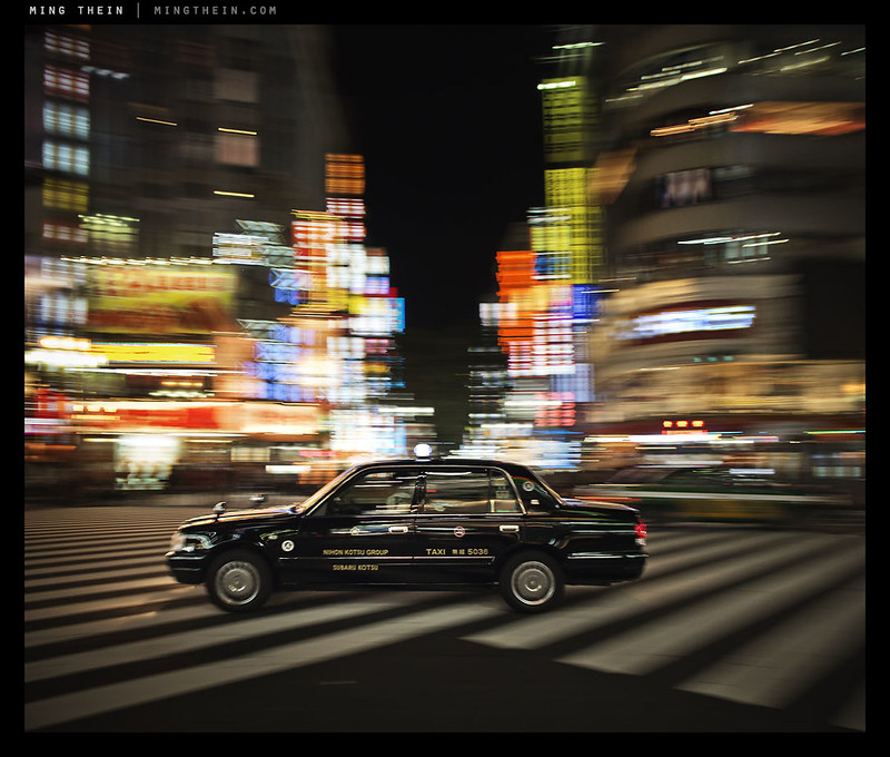
For this assignment (subject isolation), my inspiration was one of Ming's photos (see below). I tried doing motion to isolate my subject but this is very hard to do. Let's just say I failed miserably. I know some of my contacts on flickr do this very well. I've got to practice it and get it done well (future project). Anyway, look at the composition very well, do you see the 2 triangles? One in the bottom pointing to the subject and another on top, again pointing to the taxi. Then the motion blur of the colourful lights and the pedestrian crossing lines; putting a black subject against these make it isolated.
Ming's comments about the photo below: "It took a LOT of tries to get this one, because I had several factors - panning speed, shutter speed, cluttered backgrounds, taxis in the wrong place, other vehicles etc...other than having a very good idea of exactly where you want to place your subject and thus when you should release, not really. Something like this is more luck than anything else."
That's Ming being humble (I think). You still need to think carefully for you to produce something like this and lots of patience. Getting the taxi at the right place and getting it focused, "maybe" lucky, but knowing where to put it is not.
Thank You for sharing this Uegene. I have read it probably 5 times. Very helpful.
ReplyDeleteBest Wishes - Eric
You're very welcome Eric!
Delete