I just
finished my last assignment and it was a great one. As the title says it’s
about fitting the frame to subject and vice versa. It sounds quite easy
specially when you take the meaning literally but it is not as simple as
framing your subject. For this assignment cropping is allowed but only to a non-native aspect ratio. This means one of the dimensions must always remain the same as that of the camera. Cropping smaller is both lazy composition and will change the perspective properties of your lenses. The primary goal of the assignment is to learn how to
use space and essentially how to create a balanced looking image. Does it still sound easy? For me it wasn't quite so until I realized what I needed to do and the realization came from two
things:
1. Looking at many photographs online, mainly of my teacher/mentor, Ming Thein. Photographs on flickr and also portfolios of professional photographers.
2. Two comments made by Ming through our email discussions. They were "It is about how you use space period." and "Ultimately...images are just a collection of shapes."
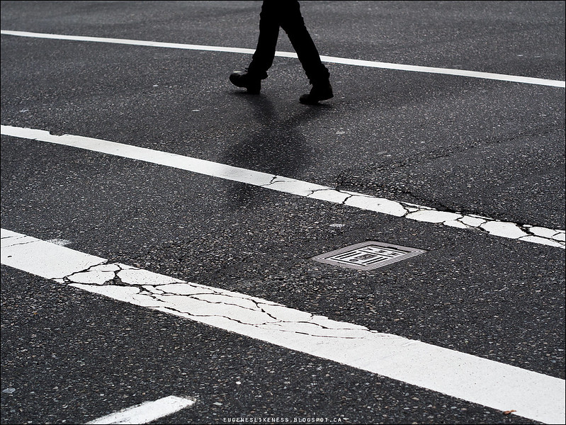
This assignment was a great one for me because it was an eye-opener. I'm not sure if it was because of the assignment or the process of researching and my determination in meeting/exceeding the objectives of the assignment. The result was very rewarding but at the same time it kind of exhausted me. You're probably asking why and it is because I was seeing differently after my eye-opening experience and all I wanted to do was create photos of all the things I'm seeing and I ended up with tons of photos (lots to analyse and process). Nevertheless, I'm very happy and the exhaustion part is easy to deal with. The photo above is the best of the bunch I produced. Here's what Ming had to say about it:
"The frame is filled with texture and diagonals; the diagonals are broken up at the bottom by the little jut that leads the eye to the manhole, which then goes to the shadow of the person, and the person; the image has a nice flow to it. No dead space, no edge intrusions, and enough to hold the attention of the viewer. Two things could make it even better, though: firstly, a little more shadow to the person, and secondly, I wonder what the image would have looked like as a vertical - you might be able to get a bit more person in, a bit more leading line in the bottom left, and I don't think it'd be any weaker if you lost a bit off both left/right margins."
Here's the other one I submitted for this assignment:

And here are Ming's comments:
"The low angle of sun gives both ship and water nice texture; your subjects stand out against the sky and sea by difference in geometry - soft vs hard vs liquid. The abstract reflection of ships balances out the ships themselves perfectly; there's the right amount of empty space around each element, and there aren't any dead zones in the frame - good job filling that empty sky patch top left with the boom. One small thing though; watch your edges. You've cut off the antennas at the top center, and the boom on the right. It isn't so noticeable because the frame is quite well balanced, but these strong straight lines are naturally followed by the eye and should either lead somewhere within the frame, or terminate cleanly."
My next assignment is related to this, it is about Balance, Symmetry and use of empty/negative space.
thanks for sharing this, E!
ReplyDeleteYou're welome!
DeleteThank You Eugene! - Eric Hanson
ReplyDeleteThanks Eric.
Delete